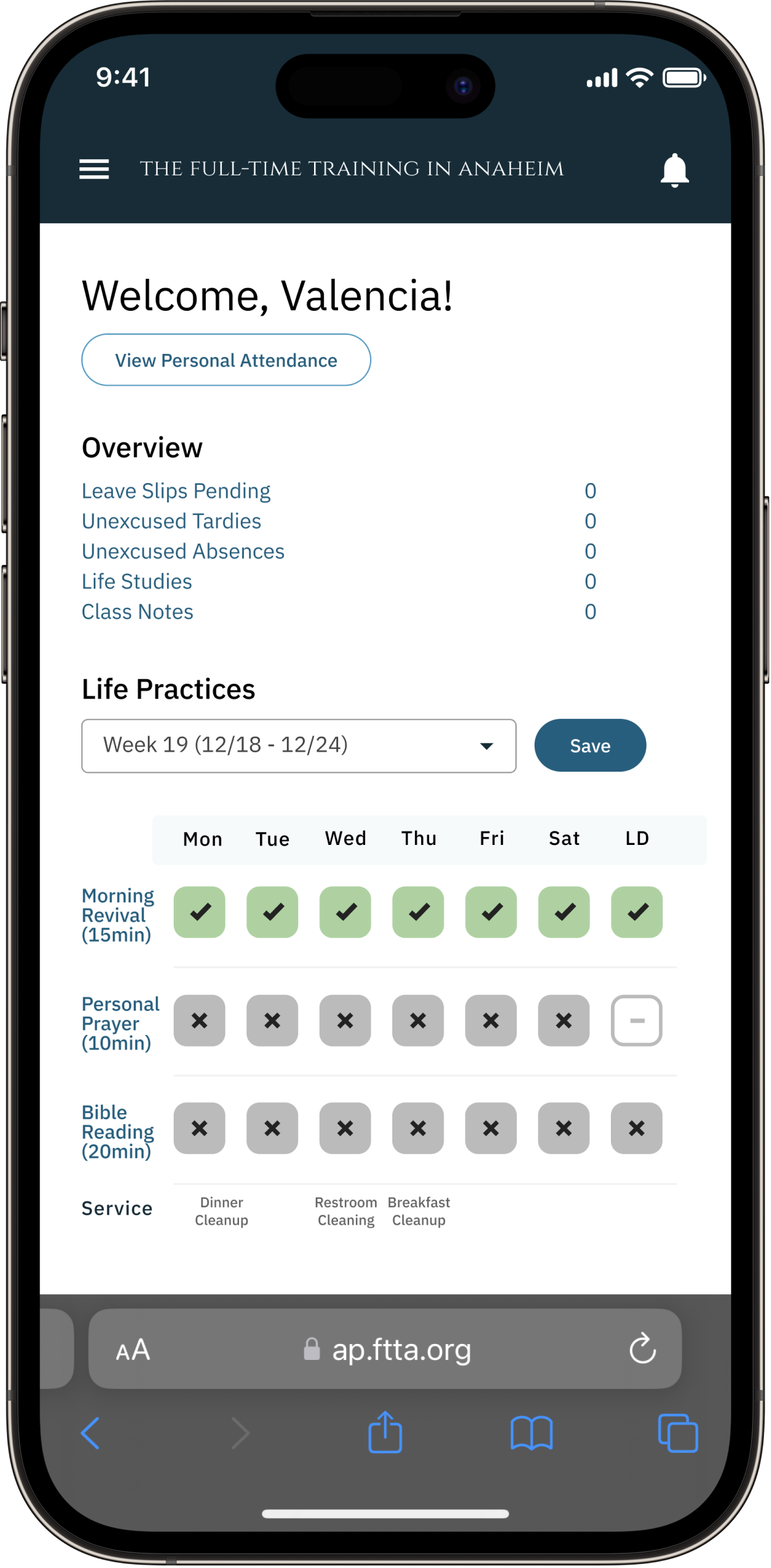
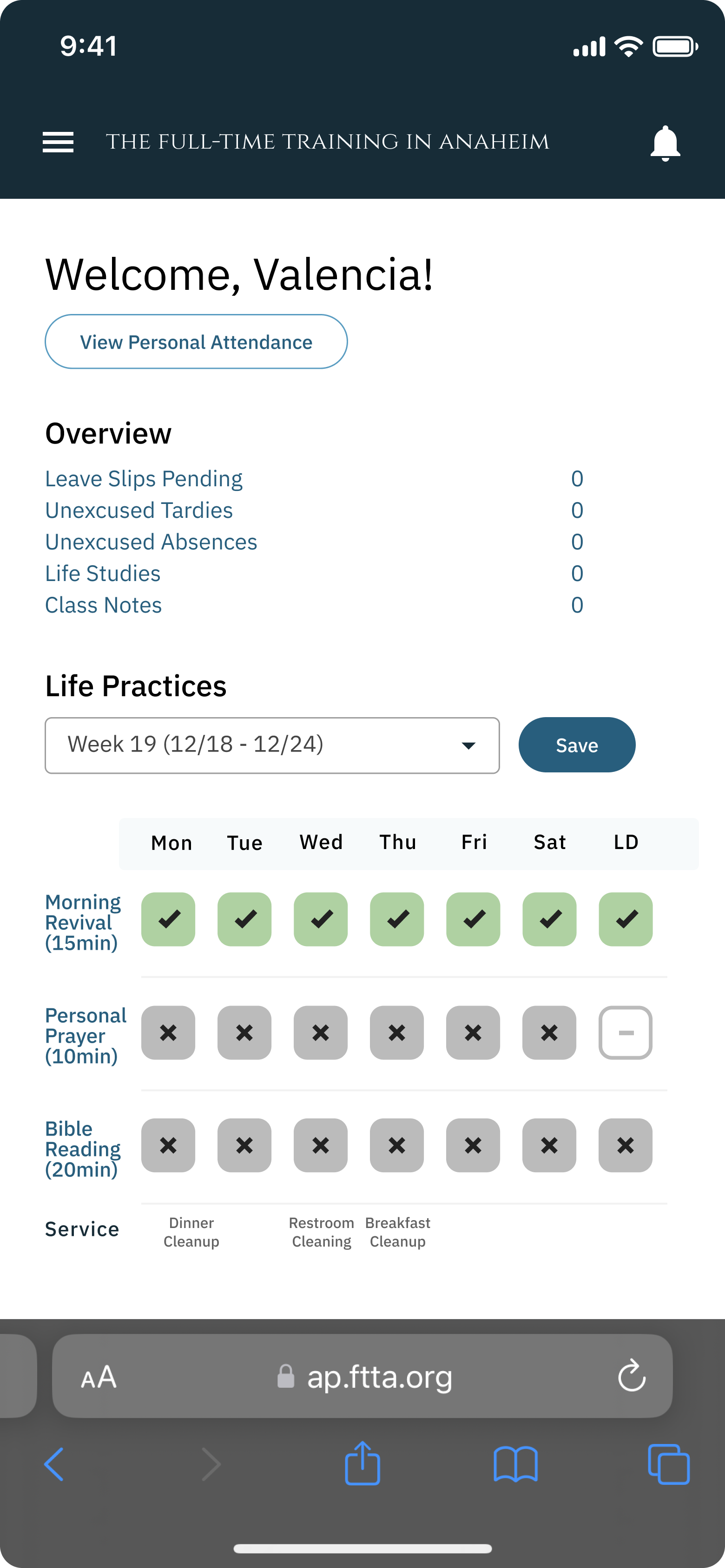
FTTA Attendance App
A comprehensive app designed to centralize communication and simplify administration for a school.
Projects
Notification Redesign
Navigation Bar
Life Practices Dashboard
Designing a Central Hub for Information
Background
The existing dashboard needed to be revamped, as the interface felt outdated and did not meet users’ evolving needs. In addition, the dashboard lacked a dedicated mobile experience, leaving users without an effective way to access key features on smaller screens.
Approach
To address these issues, I analyzed user behavior and identified pain points with the current interface. I explored updated layouts and information hierarchy to make the dashboard more intuitive. For the mobile version, I mapped key tasks and prioritized content to fit smaller screens, testing different navigation and interaction models to maintain functionality without clutter.
Result
The redesigned dashboard features a modern, clean interface with clear information hierarchy and intuitive controls. The mobile version mirrors the core functionality while adapting to touch interactions, ensuring users can complete key tasks efficiently on any device. Visual consistency and responsive design improve overall usability, making the dashboard easier to navigate and more accessible.
Notification Redesign
Simplifying Notifications for Better Engagement
Background
The notifications system had a confusing interface and provided unclear directions, leaving users unsure of what actions to take or how to manage their alerts. This created frustration and reduced engagement with important updates.
Approach
I began by reviewing the notification flow from a user perspective, mapping where confusion occurred and identifying unclear wording or poorly placed actions. I also examined how notifications were displayed across platforms, comparing patterns to common industry standards. Through iteration, I tested clearer labeling and simplified interaction points to guide users more effectively.
Result
The redesigned notifications feature introduced a cleaner UI with consistent visual hierarchy and concise, actionable messaging. Clearer prompts and better organization helped users quickly understand each notification’s purpose and respond appropriately. As a result, the system became more intuitive and encouraged timely engagement with important updates.