Clearity Health
An App to Promote Transparent Healthcare
Background
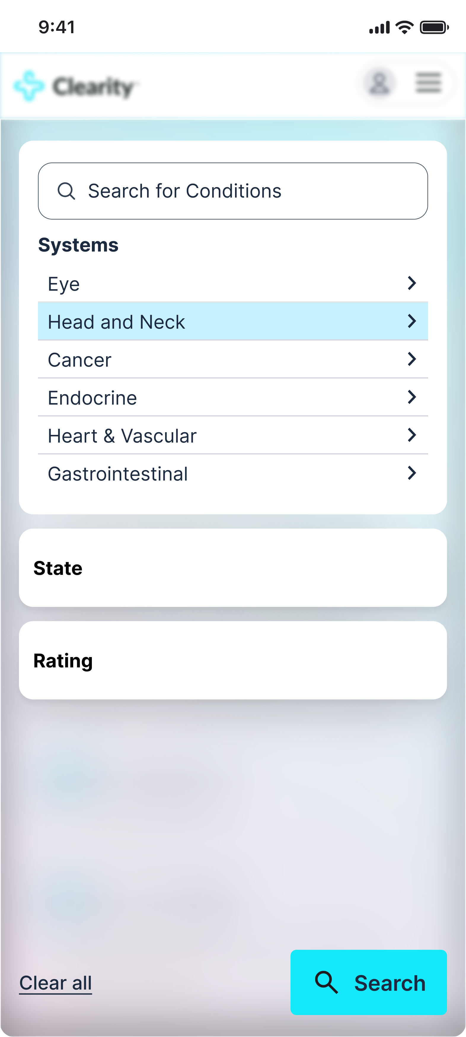
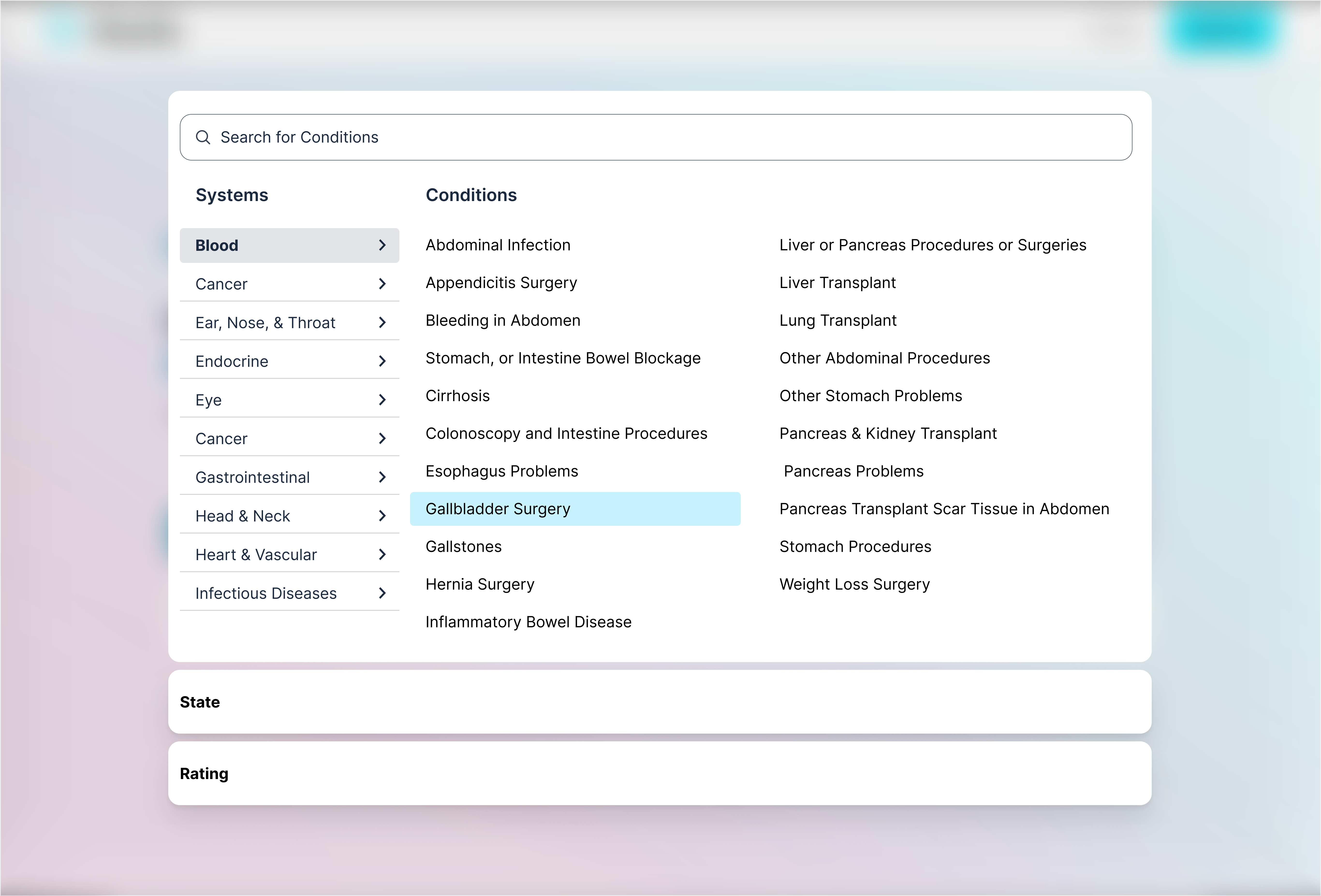
The app helps users compare provider prices across different hospital systems, but the experience required unnecessary effort to navigate and understand. While core functionality was present, users had difficulty interpreting pricing information, moving between providers, and following a clear path from search to decision. Inconsistent user flows and an outdated visual system made the experience feel cumbersome—especially for users trying to make informed, cost-sensitive healthcare decisions.
Approach
I focused on simplifying key comparison flows by clarifying pricing logic and reducing unnecessary steps. The information architecture was refined to make provider differences easier to scan and understand, while the visual system was updated to improve hierarchy, readability, and consistency. Design decisions prioritized clarity and trust, helping users move more confidently from search to comparison to selection.
Result
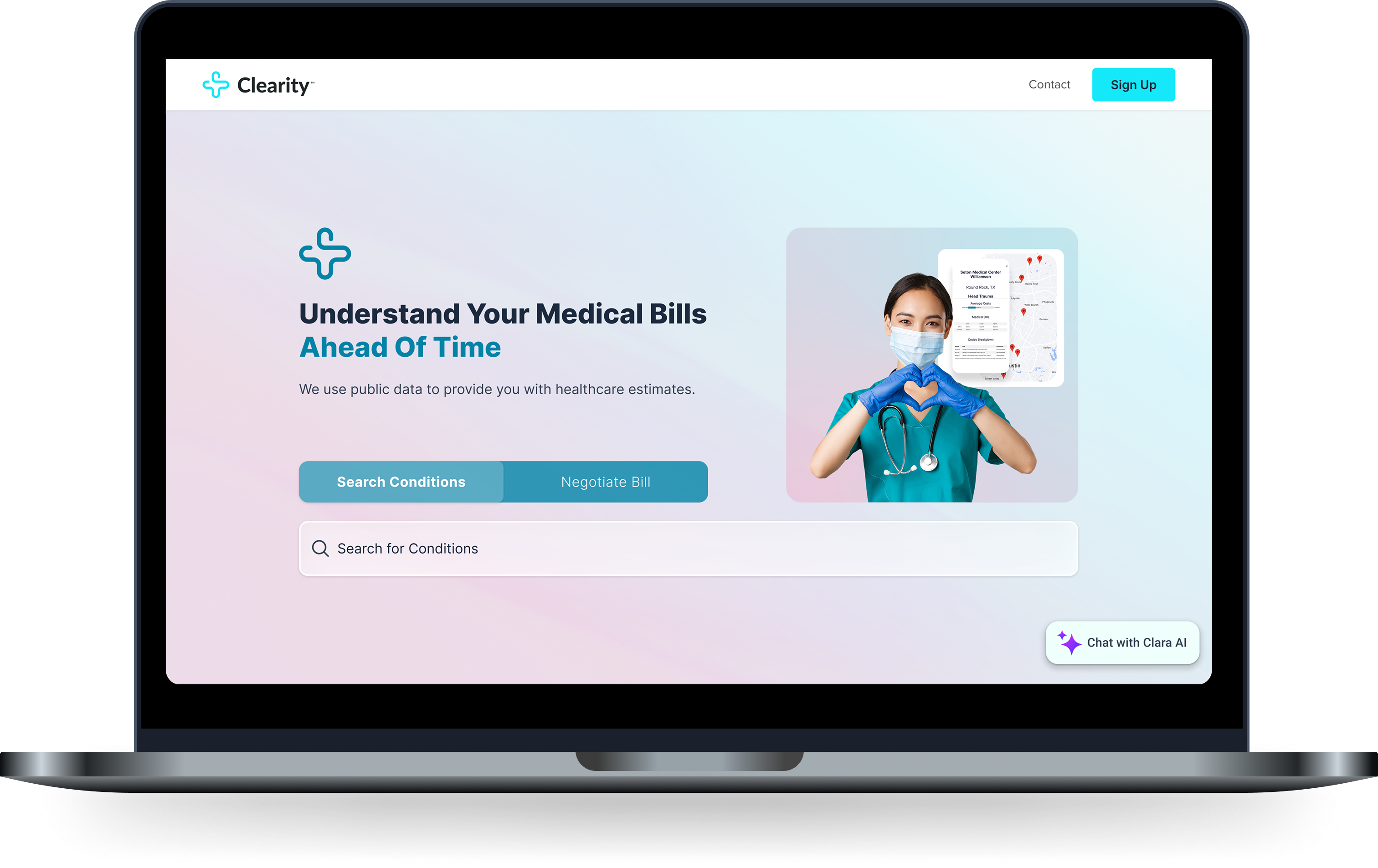
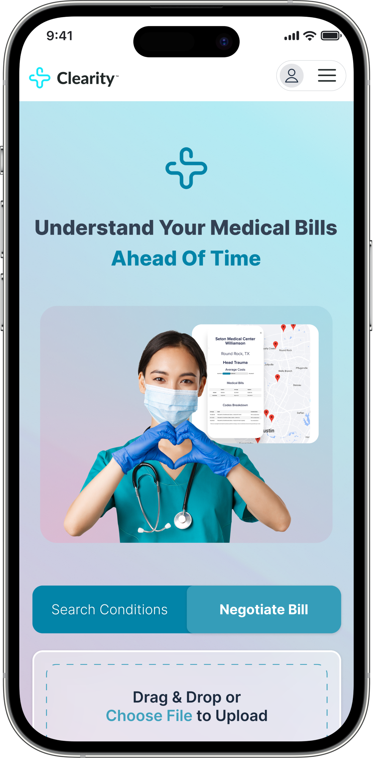
The redesigned app makes it easier for users to quickly compare provider prices and understand their options across hospital systems. Improved flow and logic reduced confusion and helped users move confidently from search to comparison to decision. A cohesive, modern visual system increased readability and trust, transforming a complex pricing experience into a clear, approachable tool for informed healthcare decisions.
.png)
.png)